Twenty EA
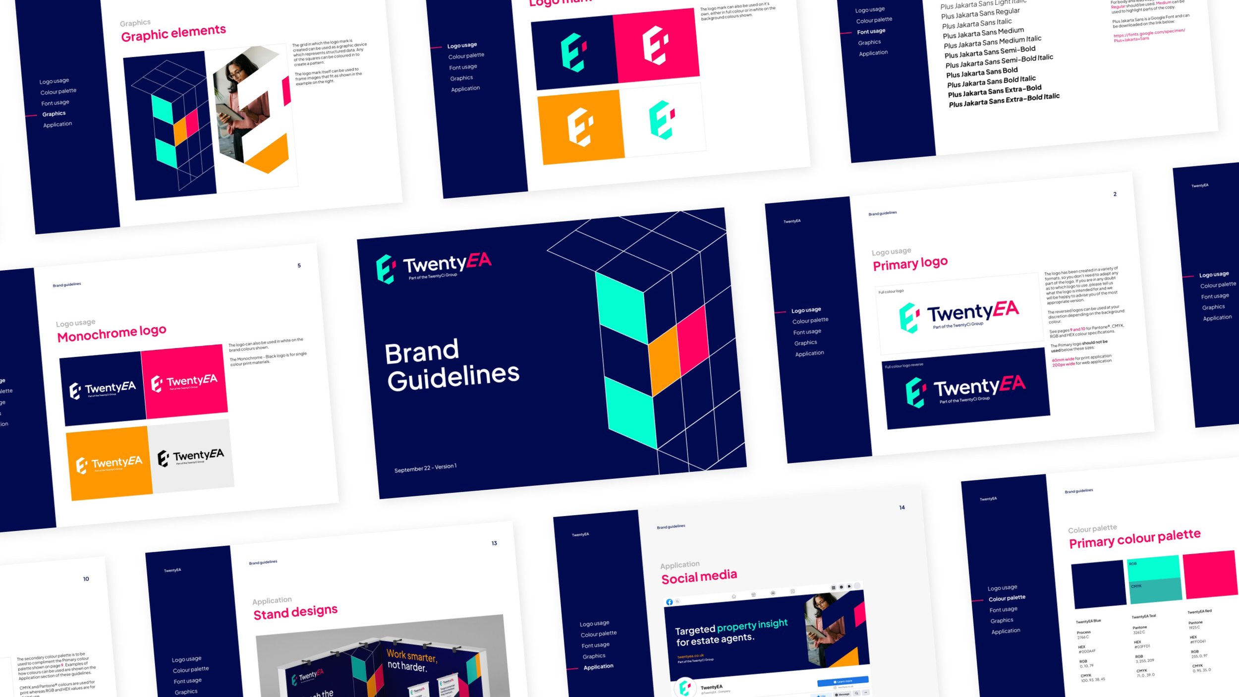
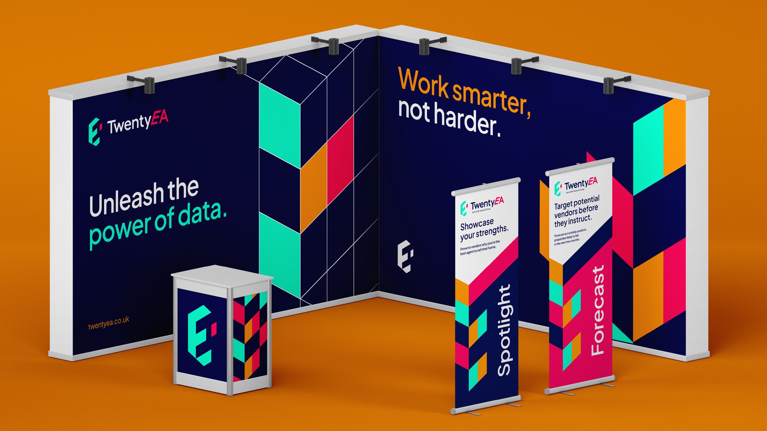
Twenty EA provides data-driven insights to estate agents, helping them optimise their business. They approached us seeking a more modern, dynamic brand that effectively communicates their expertise. The goal was to create a visual identity that captures their forward-thinking approach while clearly showcasing the benefits they offer to their clients.
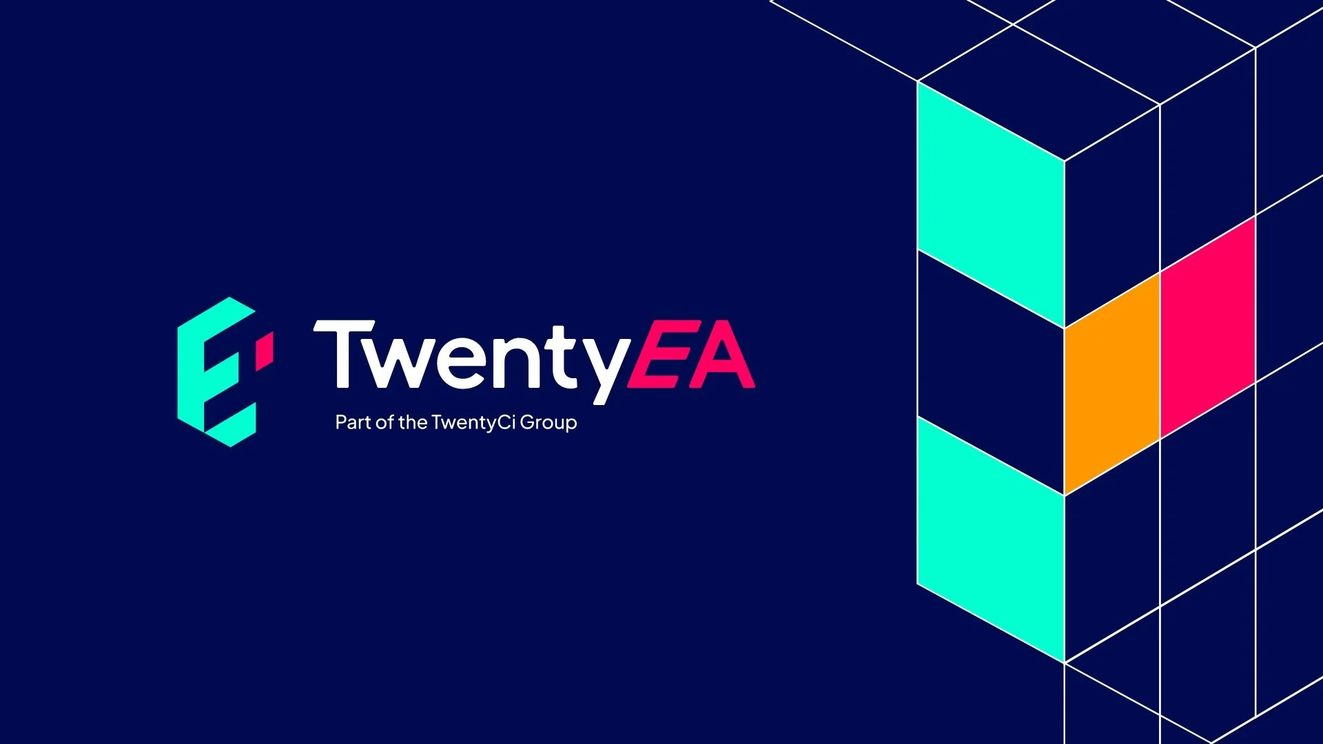
I designed the logomark using a grid system, forming an ‘E’ shape while utilising the negative space to create an ‘A.’ This approach not only reinforces the brand’s initials but also symbolises the structured, organised nature of their data.
